
Table of Contents
NayaPay, one of Pakistan’s fastest-growing fintech platforms, has officially unveiled a bold new brand identity and upgraded user experience, signaling its transition into a full-spectrum digital financial services ecosystem.
Launched three years ago, NayaPay has quickly garnered over 2.5 million users, steadily expanding its suite of products, including digital wallets, payment tools, and Visa card services. The rebrand reflects both its achievements and its ambitions for the future.
Created in Collaboration with Global Design Powerhouse Koto
NayaPay’s rebrand was conceptualized and executed in collaboration with Koto, a renowned international brand agency known for leading global transformations, including Amazon’s recent visual overhaul.
With this redesign, NayaPay aims to set a new benchmark in fintech design in the region, aligning itself with global standards while staying culturally relevant to the Pakistani user base.
Introducing “Dyno” — The New Symbol of Financial Movement
At the core of NayaPay’s new identity is Dyno, a dynamic emblem created from interlocking arrows. This abstract symbol represents the continuous flow of money, connection, and progress—values central to NayaPay’s mission.
The arrows not only reflect movement and momentum but also symbolize the relationship between people and businesses in the financial ecosystem.
Accompanying the Dyno is a refined wordmark that feels both contemporary and trustworthy, signaling a more mature brand image.
A Fresh Palette: Electric Orange Takes Center Stage
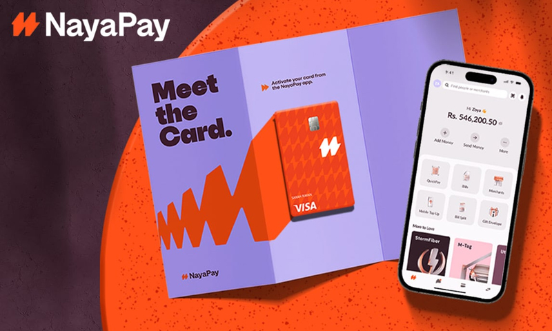
With the rebrand, NayaPay introduces a vibrant new color scheme, led by its signature color dubbed “Electric Orange”. The hue symbolizes energy, optimism, and visibility, helping the brand stand out in a rapidly growing fintech landscape.
HEC Publishes PM Laptop Scheme Merit List for Sindh Students, Objections Due by July 4
This energetic palette is balanced with deep charcoals, metallic tones, and lighter neutrals, used across the app interface, marketing visuals, and printed collateral.
Refined Typography and Custom Illustrations Inspired by Currency
The updated brand identity includes:
- New typography with bold, clean lines designed for readability and digital adaptability.
- Metallic illustration styles, inspired by textures and materials used in coins and banknotes.
- Custom icons that mimic the geometric forms found in the new Dyno emblem.
Together, these elements create a cohesive, future-forward aesthetic that reinforces NayaPay’s role as a modern financial partner.
The NayaPay App Gets a Complete Visual and Functional Overhaul
Beyond cosmetic upgrades, the NayaPay mobile app has also undergone significant changes. Users can expect:
- A streamlined user interface (UI) that simplifies navigation.
- Faster access to key services such as bill payments, funds transfers, and virtual cards.
- Improved onboarding for new users, with clearer educational prompts and smarter design flow.
The upgrade aims to enhance both form and function, making the app more accessible, intuitive, and engaging for both new and existing users.
Physical and Virtual Visa Cards Receive Modern Vertical Design
In line with global trends in card design, NayaPay has redesigned both its Visa Physical Cards and Virtual Cards. Key changes include:
- Vertical orientation for a sleek, modern look.
- Updated branding and color scheme matching the Electric Orange identity.
- Enhanced security elements and visual appeal.
These design changes reflect a shift toward more mobile-first, card-lite experiences, where virtual transactions take precedence but physical cards still carry brand significance.
“This Is Just the Beginning” — NayaPay on What Comes Next
While the visual transformation is striking, NayaPay is positioning this rebrand as the foundation for much larger developments in its product roadmap.
“This isn’t just a rebrand. It’s the launch pad for everything we’re building next,”
— NayaPay statement
The company has hinted at future launches in lending, investment tools, and expanded merchant services, all supported by the new, unified design system that allows for rapid scaling.
Phased Rollout to Ensure Seamless Transition
The new app design and visual elements are currently being rolled out in phases to users across Android and iOS platforms. Existing users may see gradual updates as part of an adaptive migration plan, ensuring that no disruption occurs in daily usage.
NayaPay encourages users to update their apps to the latest version and explore the enhanced features and design for themselves.
Final Thoughts
NayaPay’s bold rebranding is more than a facelift—it marks a pivotal point in the company’s journey toward becoming Pakistan’s go-to digital financial platform. With global design thinking, local insight, and user-centric evolution at its core, NayaPay is clearly betting on brand, trust, and technology to lead its next chapter.
As fintech competition intensifies in Pakistan, NayaPay’s focus on visual identity, usability, and innovation may give it a key edge in capturing the next generation of digital-first consumers.
